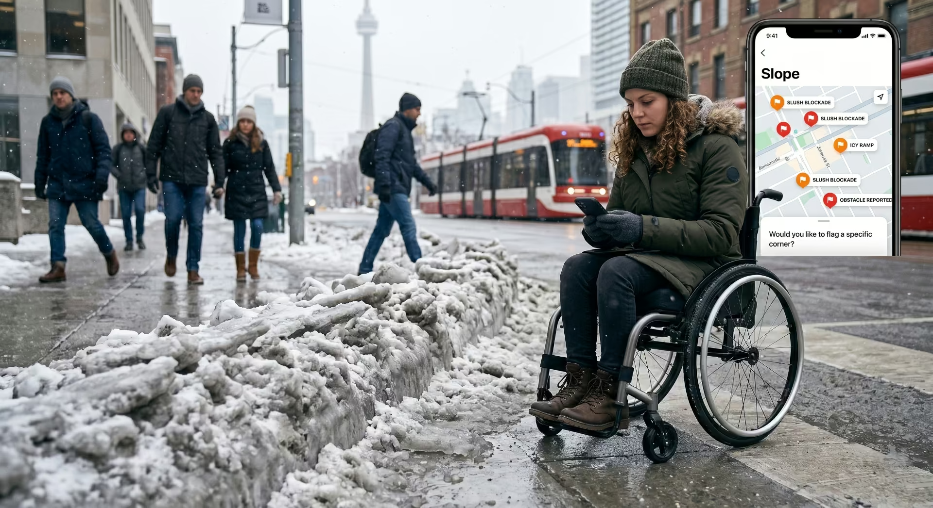
There’s a moment that happens every February in Toronto. The temperature swings from -12°C to +3°C inside 36 hours, the snow at every intersection turns to slush, refreezes overnight, and by morning the curb cuts — those gentle ramps where the sidewalk meets the road — have become small, hostile glaciers.
For most pedestrians, this is an inconvenience. For a wheelchair user, a parent with a stroller, a person with a cane, or anyone whose feet don’t pick up enough to clear two inches of frozen slush, it’s the end of the trip.
We’ve been building Slope for two years. The first version routed users along sidewalks ranked by slope angle, surface quality, and curb cut presence. It worked well in May. It collapsed in January. This post is about what we learned trying to fix that — and why “winter accessibility” turned out to be the wrong frame entirely.
The curb cut effect, and the season we forgot
The curb cut is the canonical example of universal design. Built originally for wheelchair users, it now serves anyone with wheels — strollers, delivery carts, suitcases, skateboards. The economist’s term is positive externality. The designer’s term is the curb cut effect: design for the most constrained user, benefit everyone.
The standard story stops there. What it leaves out is that the curb cut effect has a season.
In summer, a well-maintained curb cut serves everyone. In winter, an un-cleared curb cut serves no one — but the cost is distributed wildly unevenly. The able-bodied pedestrian steps over the snow ridge and forgets it existed. The wheelchair user goes home. We started calling this seasonal ableism: a feature of the built environment that is technically accessible for two-thirds of the year and quietly excludes for the other third.
The data backs this up. In our Toronto pilot, the number of wheelchair-user trips logged in Slope dropped 61% between November and March compared with summer baseline. We initially read that as seasonal preference. After interviewing 40 of those users, it was clearly not preference — it was the trip not being possible.
What we tried first, and why it didn’t work
The first instinct was the obvious one: add a winter layer to our existing routing. We’d pull City of Toronto plow data, weight routes by how recently they’d been cleared, and serve users a “winter-aware” path.
It half-worked. Three problems surfaced in the first two weeks:
- Plow data tells you the road was cleared. It tells you nothing about the sidewalk. And the sidewalk is where pedestrians live.
- Sidewalk clearance in Toronto is split between the city, property owners, and BIA programs depending on the block. There is no single source of truth. There is barely a source of guesses.
- The corner — the curb cut — is everyone’s responsibility and therefore no one’s. The plow pushes snow onto it. The shoveler clears the sidewalk but leaves the corner. The crossing pedestrian compacts what’s left into ice.
We were trying to route around a problem with data that didn’t describe the problem.
The shift: report-first, not data-first
The version of Slope that’s running in Toronto for winter 2025-2026 is built on a different assumption. Authoritative data about sidewalk and curb cut conditions does not exist in real time, so we stopped pretending it did. Instead, we built around the people who actually know what the corner looks like right now: the users themselves.
The mechanics are simple:
- A user finishes a trip in Slope. The app asks two questions at the end: “Did you encounter any blocked or unsafe segments?” and “Would you like to flag a specific corner?”
- Flagged corners go into a live layer that decays over time. A report ages out in 6 hours by default; faster after a documented plow pass, slower after a confirmed re-freeze.
- Other users routing through that area within the decay window see the corner flagged. The routing engine prefers alternate paths if any exist within a tolerable detour.
- Cross-checks against official 311 data and weather feeds prevent the layer from being dominated by a single bad-faith report.
It is not elegant. It is not the kind of system that wins design awards. It works because the underlying problem is fundamentally a coordination problem among pedestrians, not a data problem to be solved from above.
The technical pieces, briefly
For the engineers reading this, the stack looks like:
| Layer | What it does | Source |
|---|---|---|
| Base routing graph | Sidewalk segments, slope, surface | OpenStreetMap + city open data + our own surveys |
| Curb cut inventory | Presence, ramp angle, condition | Our crew + crowd-sourced photos |
| Plow pass layer | Recent road clearance, timestamped | City of Toronto open data feeds |
| Weather layer | Temperature, precipitation, freeze events | Environment and Climate Change Canada API |
| Live user reports | Time-decaying obstacle flags | In-app reports, weighted by reporter history |
| Routing engine | Weighted shortest path with hard exclusions | Custom, A* variant |
The piece we spent the most engineering time on is the report decay function. A report that’s 30 minutes old in a -15°C cold snap means something different from a report that’s 30 minutes old in a +2°C melt. We model both temperature and precipitation in the decay curve, and weight reports from users with verified history more heavily than first-time reports.
What the users have told us
Three things we didn’t expect.
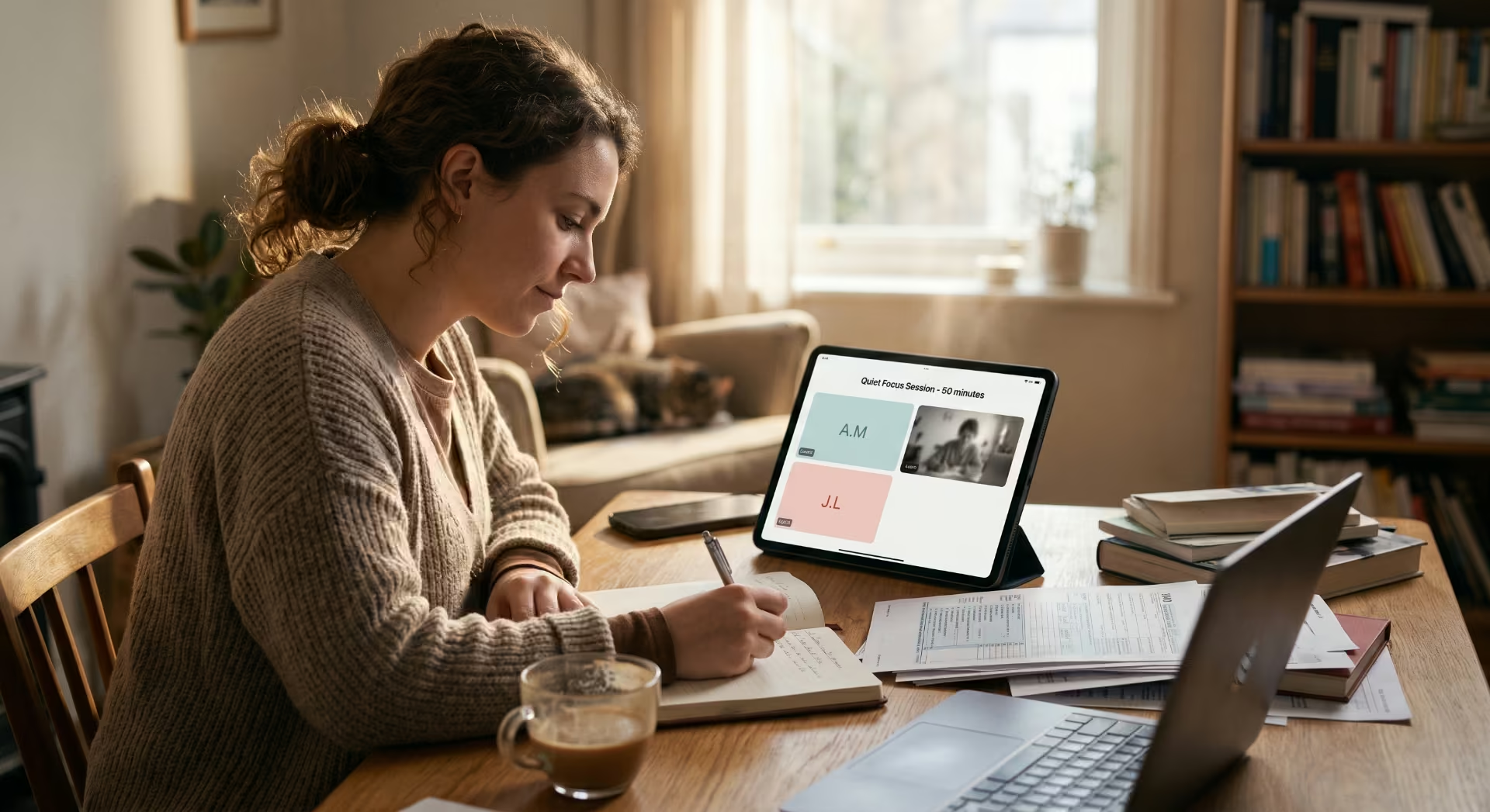
First, the most-used Slope feature in Toronto isn’t routing. It’s the “is this corner usable right now?” check before someone leaves the house. Several users told us the actual product is decision support before the trip starts. The route comes after.
Second, the people most active in reporting blocked corners are not the people most affected by them. Power users with strollers and delivery couriers do roughly twice as much reporting as wheelchair users do, because they’re outside more often and the cost to them of reporting is lower. The system works because the curb cut effect runs in both directions — the people most served by accessibility infrastructure are not always the people doing the maintenance reporting.
Third, a non-trivial fraction of reports describe corners that are technically passable but mentally exhausting. A six-inch slush ridge is not a hard barrier for everyone, but the cognitive load of approaching every corner not knowing what’s there is its own form of disability. We’ve added a “low-effort route” preference that prioritizes route predictability over route length.
What we’re working on next
The honest roadmap, in priority order:
- Tighter integration with City of Toronto 311. Right now our user reports and the city’s reports live in parallel. They should be feeding each other.
- Property-line clearance data. The single biggest data gap is who is responsible for clearing which sidewalk segment. Until we crack this, our reports are a band-aid on a coordination failure.
- Predictive routing. Given a freeze-thaw forecast, which corners are likely to be blocked in 12 hours? We have enough historical data after one Toronto winter to start trying this.
- The reverse problem. Summer construction routing is the warm-weather equivalent of winter snow routing — temporary obstacles, no authoritative source, real impact on accessibility. The same report-first architecture should generalize.
The frame we landed on
We started thinking we were solving a Toronto winter problem. We ended up thinking we were solving a problem about how cities distribute responsibility for the built environment, and how that distribution fails seasonally and predictably.
The curb cut effect is real. It’s also conditional. A city that builds curb cuts but doesn’t clear them is a city that took accessibility seriously in 1995 and stopped. Slope is, in the most literal sense, a workaround for that gap. It would be better if the workaround weren’t needed.
In the meantime, if you’re in Toronto this winter, Slope is free to download. If you find a corner we missed, please flag it. The next user routing through there will thank you, even if they never know you were the one who reported it.
Building accessibility products and want to compare notes? Hiring in Toronto for accessibility roles? Reach out — we’d love to talk.